


 (1)")


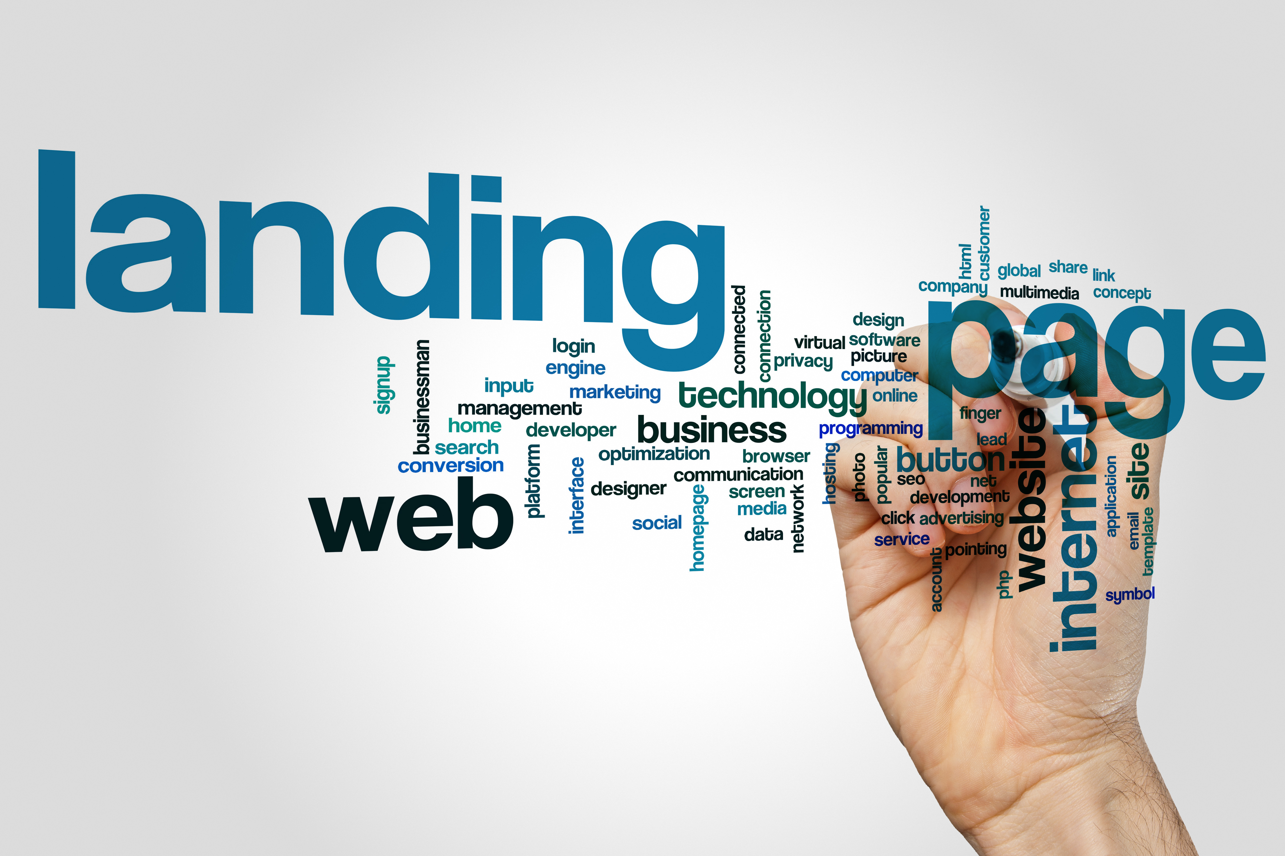
Planning out a captivating and engaging landing page is a crucial component of a successful marketing campaign. Your landing page might be the one chance you have to capture your customer’s attention, so you want to make sure to make a lasting impression.
Here are some best practices to improve conversions from your landing page:
Lizard Brain
 Our brains operate on two systems. The first system is the so-called “lizard brain”, which relies on instinct and intuition, as opposed to logic and reason. The second system in our brains can digest more complex information and draw conclusions from it. You do not want a landing page that has to be understood and analyzed by your customer; you want to appeal to the lizard brain.
Your landing page content should be as streamlined as possible because people make very quick, instinctive decisions when browsing the internet. No one reads, they scan! You will want to make sure you have concise, easily-absorbed points that appeal to instinct and are free of superfluous, complex content. If you have too much irrelevant information, you will lose conversions.
Headline
A carefully crafted headline is another critical aspect of your landing page, and you should make it about the buyer. Don’t just say how great you are, use your headline to highlight what might have driven them to click your link in the first place. So, for example, as a question! Suggest something they might want in a way that prompts their lizard brain to answer “yes!”. A question that prompts an affirmative answer will naturally encourage the visitor to continue reading.
Most customers in “lizard brain” mode are hesitant to respond to any CTA if there is even a shred of uncertainty as to what should happen next. Make sure you’ve got the next steps clearly outlined in plain English and exactly what they can expect when they take these next steps. This is the best security you can ensure your conversion rates.
One Call-to-Action
 The CTA is the most important feature of your landing page, and you want to make sure you narrow it down to only one. The more CTAs you have, the more reasons to opt-out completely you give your confused and overwhelmed customers. You want to make one appealing buying option, again, to appeal to the binary lizard brain, and make sure everything on your landing page supports that offer. Downplay offers to sign up for additional services or newsletters that might distract from the primary objective.
Hero Image
 Your hero image, or principal image on the site, should be relevant and an accurate reflection of your product or service. Showcase your most stylish cabinetry, installed in a beautiful kitchen, for example. An obvious hero image might seem like a no-brainer, but it is a surprisingly common mistake to use images on a landing page that don’t convey the mission of a company to the lizard brain customer.
You also want to be sure you have cohesion and consistency between your hero image, CTA, and headers, and the source that led the customers to your landing page. For example, if they clicked an ad for affordable, custom cabinets, make sure that beautiful, custom cabinets are precisely what they see when they arrive at their destination!
Social Proof
 Social proof is a crucial aspect of an effective landing page. You want to make sure you’ve got at-a-glance “proof” of your success and accreditation. Outstanding customer testimonials, badges of industry organizations, awards, recognizable brands that use your product or service, all in visual expression. This way, you immediately satisfy any skepticism the customer might have that you’ve got an excellent track record in the business and happy customers.
Sense of Urgency
A very effective appeal to the “lizard brain” is to create a sense of loss, the potential of “missing out” if your CTA is not followed. What will your customer stand to lose if they hesitate on following through on your offer? How can you encourage them to take action now? Infusing this sense of urgency into your CTA is more likely to result in a conversion.
Universal Appeal
 Finally, you want to make sure that at the end of the day, you’ve got a landing page that your 95-year-old grandma could use. Keep it simple, straightforward, and don’t clutter up your page or get too fancy with the technical aspects. You don’t want to create any barriers between someone visiting your page and their potential as a paying customer. Make sure you’re creating a page and CTA that even the least-savvy Internet user could easily navigate, understand, and respond.